
Challenge
NPL Group is the UK’s largest brownfield regeneration firm, transforming former industrial and commercial land into productive, sustainable futures. Over two decades of growth through acquisition left the Group with a fragmented collection of legacy brands. The lack of clarity diluted impact, confused stakeholders, and made it harder to communicate the organisation's scale and purpose. NPL needed a clear core proposition and a cohesive brand hierarchy that could operate across a diverse portfolio.
Do you have a similar challenge?
Please get in touch to start a conversation about how our expertise can help your business thrive.
Solution
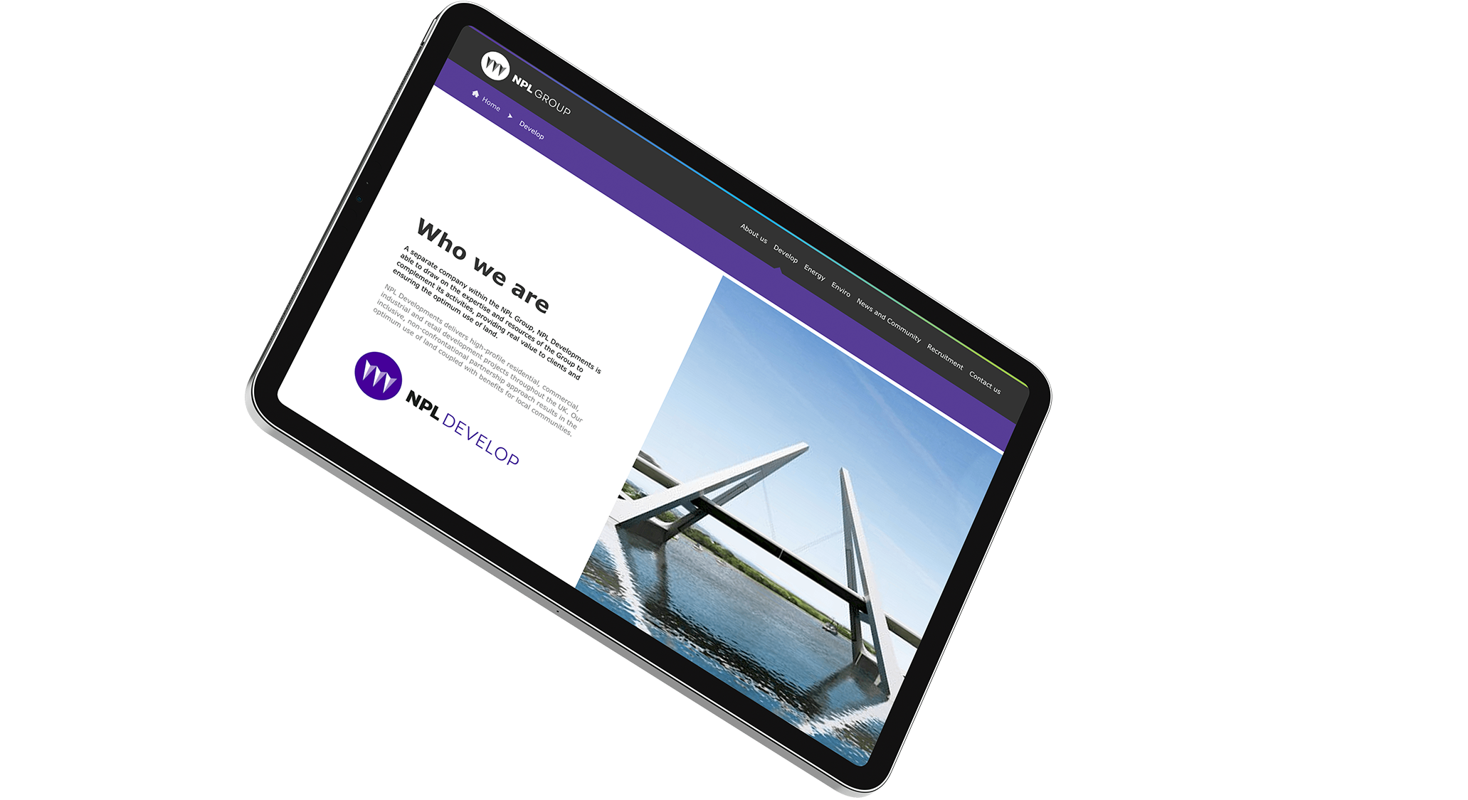
Equator partnered with NPL to define a unifying brand and apply it consistently across a complex group structure. The work focused on clarity, scalability, and long-term governance.
- Conducted leadership workshops to understand the full breadth of the Group
- Defined a simple, powerful core proposition, We transform land
- Evolved the group identity using existing brand equity
- Created a flexible design language applicable across all businesses
- Developed the three stakes symbol to represent the Group’s core services
- Development
- Energy
- Environmental services
- Applied colour variation to differentiate services while maintaining unity
- Designed a clear brand hierarchy, mapping up to 13 businesses within each service
- Created a suite of icons to represent specialist activities across the Group
- Delivered a comprehensive brand bible covering visual and verbal standards
Results