
Challenge
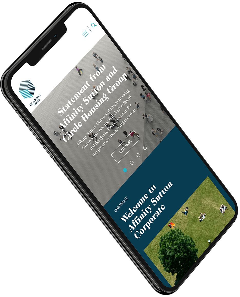
The merger of two established housing organisations formed Britain’s largest housing association. The scale and prominence of the new entity required a clear, confident identity that could unify teams, reassure residents, and project a progressive image to partners and regulators. The task was to develop a master brand and three distinct sub-brands that functioned coherently across social housing, development, and commercial sectors activity.
Do you have a similar challenge?
Please get in touch to start a conversation about how our expertise can help your business thrive.
Solution
Equator partnered with Clarion to define and deliver a branding system designed for scalability, clarity, and long-term relevance. The emphasis was on creating a modern, purpose-driven identity that reflected social impact while supporting operational complexity.
- Defined a clear master brand positioning aligned to Clarion’s social purpose
- Created three distinct yet connected brands within a single coherent system
- Developed a visual and verbal identity designed for accessibility and inclusivity
- Ensured the brand worked across resident communications, corporate audiences, and partners
- Delivered practical brand guidelines to support consistent rollout at scale
Results
A clear, unified identity for Britain’s largest housing association
Strong internal alignment following the merger
A flexible brand system that supports multiple audiences and service
Outcome
Clarion Housing now presents a confident, future-ready brand that reflects its scale, ambition, and social purpose. The new identity offers clarity following the merger, fosters trust with residents and stakeholders, and lays a strong foundation for long-term growth and impact across the housing sector.